Glossier
The Beauty website is about having fun, being free, and being OK with who you are.
They make and sell intuitive, uncomplicated products designed to make their customers feel their best selves.

Problem
While Glossier website continues to be successful, with numbers of sales growing day by day.
Their app remains below average, and the main reason for that is that they don't have an app!
In this day and age where Competitors like Sephora and Ulta Beauty have developed apps for their customers, Glossier still has yet to develop an app.
Competitors

Data On Mobile Apps
-
Mobile apps contribute to such high-intent buying actions from consumers.
-
Mobile apps are more convenient than other channels for shopping.
-
Typically, users stay logged into apps, meaning they don’t have to type in passwords.
-
Most users have securely stored their card info on their mobile devices via Apple Pay or Google Wallet, making payment a breeze when purchasing.
Target Audience
Young adults with interest in Makeup and Skin Care.

Design Process
While designing the app, I tried to imagine myself as a customer and brainstorm what would make my shopping experience easy and quick. So with that mindset, I started designing and prototyping what the app might look like.
I knew I wanted the app to have a clean Checkout design because from the research I have done, that is what makes and breaks the likelihood of a purchase being made.
For example, if the checkout station is too confusing to figure out, the possibility of the customers getting frustrated and clicking off the app will be very high.
Wireframe

Checkout Station Mock-up
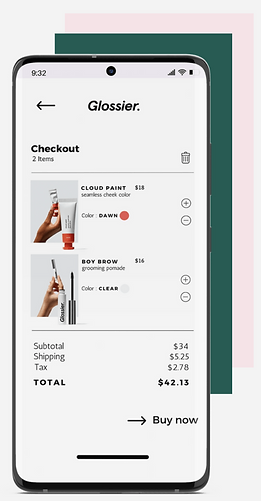
I made the design for the checkout station very simple and straightforward.

Design Process II
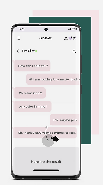
Another feature of the app I wanted to focus on is the Help Chat.
I wanted the Glossier app users to be able to ask for instant help without having to wait for the response of an email or call.
As I was brainstorming the features I wanted to put on the app I remember an experience I had with a personal purchase a couple of days prior and how much that website help chat came in handy.
Wireframe

Help Chat

Outcome and Edits
This is my first ever attempt at designing an app, and I'm quite proud of how it came out. I liked the visual aspect of the design. But if I could go back and fix the design, I would change a few things.
-
I would get accurate user-testing.
-
I would try out different designs.
-
I would be in a team instead of doing it all myself.
-
I would focus more on the user experience as equally as I did for the user interface design.
-
I also would like to do the full app prototype.
Final mockups
